Whether you’re assembling your wardrobe, decorating a room or matting a painting, it’s helpful to know which colors help each other pop and look most appealing to the eyes.
Today we have a very special guest named one of the best dressed man in Africa, Style Guru, Esquire’s favourite fashionista and TMZ’s favourite Fashion consultant Gwei Noel Yengong (Manlikeclix) who will tell us how to match and mix colors which is one of the most difficult issues both men and women face when it comes to fashion and style.
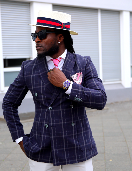
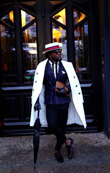
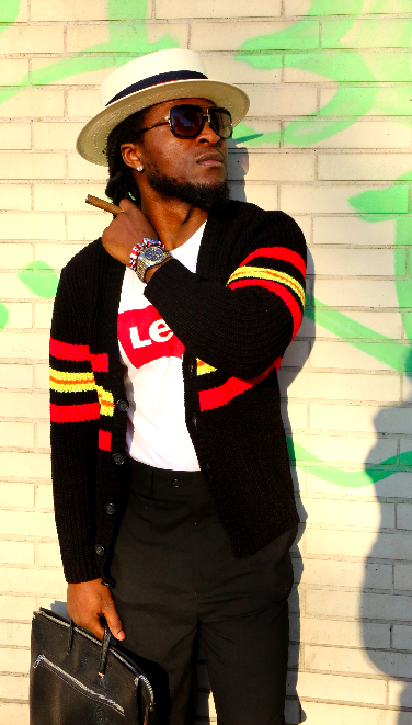
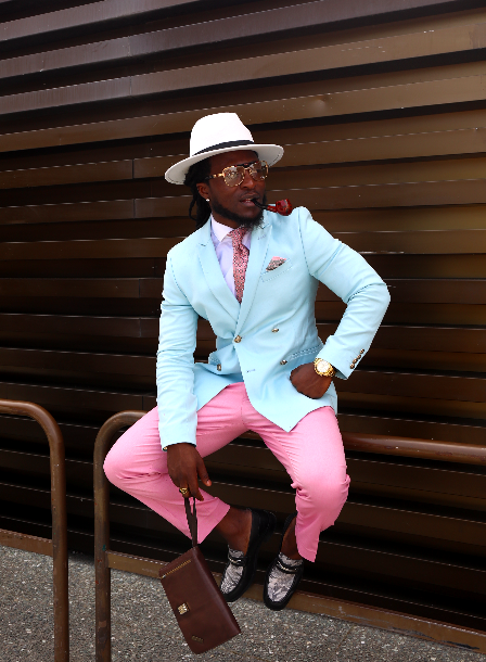
Scrolling through Noel’s instagram, @manlikeclix you will notice an aligned pattern of colors well put together appealing and of course not weird or bizarre to the eyes from his Pitti Uomo day 4 look to the grey’s patterns and many more. It is evident that Manlikeclix knows exactly what to do when it comes to matching colors. Let’s talk.
Team: Hi Noel, Good to have you
Manlikeclix: Pleasure is mine.
Team: Now let’s get into business. How do you match colors to look that appealing on your instagram?
Manlikeclix: Color theory explains which colors will match and which colors won’t go together. Therefore, it is important to have a proper understanding ( at least a basic knowledge of colors ) in order to know how to put them together.
You can start by looking at a color wheel and learning which colors look best grouped together.
The color wheel is a diagram of colors that provides a useful illustration of what colors match and what colors don’t work well together, divided into 3 Primary colors, Secondary colors, secondary and tertiary colors. Now let me explain all the colors first.
* Primary colors: red, blue and yellow. These are the colors that cannot be mixed using any other colors.
* Secondary colors: Green, orange and purple. These colors are made by mixing primary colors in different combinations.
* Secondary and tertiary colors: Yellow-orange, red-orange, red-purple, blue-purple, blue-green and yellow-green. These are created by mixing a primary color with a secondary color.
The concept of matching is also called “color harmony,” which is achieved when colors create a pleasing effect. Red, yellow and blue always harmonize. These colors are bold and eye-catching, and they never really go out of style. Whether you’re putting together a palette for your wardrobe, a painting or your dining room, you can depend on primary colors to lend your project a cheerful and bright appearance.
* Bold primary colors are often associated with young children, tropics, and sports teams. However, there is no reason you cannot play with darker or lighter hues.
* If you want your project to look more sophisticated, you might want to consider using just one or two of the primary colors, rather than all three. A red, blue, and yellow outfit might look a little juvenile, but a yellow and red combination be more sophisticated.
Look at the color wheel and pick any color, then move your finger to the color just opposite. Colors opposite on the wheel are complementary colors. When you place them next to each other, they help each other stand out and the combination looks appealing.
* Complementary colors of the same brightness and hue will always work well together.
* Popular complementary combinations include blue and orange, purple and yellow, and green and pink.
Tips: These are basic color matching and can be played with the way you feel as long as you don’t go off the rails.
Team: Thanks so much for helping out with such a hard topic.
Manlikeclix: It is always a pleasure. I’m very passionate about impacting and giving out the little knowledge I have to the world and to the youths for a better place. Thanks again for having me.
For more style inspiration, Don’t forget to check and follow Manlikeclix on instagram www.instagram.com/manlikeclix